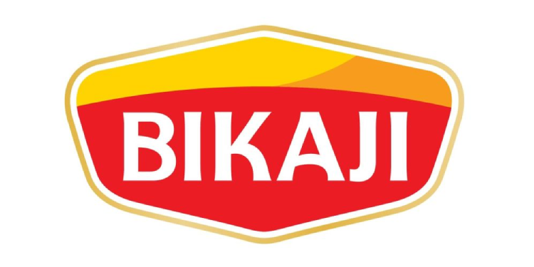
Bikaner: Bikaji Foods International Limited (Bikaji), India’s third-largest ethnic snacks company and the second fastest-growing player in the organised snacks market, has unveiled its new brand logo, marking a significant milestone in its evolution as it looks to strengthen its modern, global-facing identity while staying rooted in tradition.
Inspired by Bikaji’s deep-rooted Rajasthani heritage, the new logo is designed around a distinctive royal shield that symbolises trust, legacy and pride—values that have defined the brand since its inception. The upper curve of the shield subtly reflects the silhouette of a traditional Rajasthani turban, representing honour and hospitality, while its fluid lines draw inspiration from the golden sand dunes of the Thar Desert, paying homage to Bikaji’s origins in Bikaner.
Speaking on the brand refresh, Deepak Agarwal, Managing Director, Bikaji Foods International Ltd., said, “Our new logo is more than just a design, it’s a celebration of who we are, a blend of tradition and modernity. As we gear up for 2026, this refreshed visual identity aims to strengthen Bikaji’s connection with its loyal consumers while appealing to new generations. It reflects our heritage, values, and unwavering commitment to authenticity, taste, and quality, even as we continue to expand our footprint across domestic and international markets.”
Highlighting the strategic intent behind the change, Neha Rao, Vice President – Marketing, Bikaji Foods, said, “Bikaji has always been in the forefront of impactful marketing, from large scale campaigns like Bikaji Khao, London Jao to our recent collaboration with Pankaj Tripathi as the brand icon for our Uttar Pradesh market expansion. These initiatives reflect our aggressive marketing strategy and our ambition to strengthen and expand Bikaji’s presence across India and beyond.
As we grow, its vital for us to stay deeply connected to our traditional roots while reimagining how the brand speaks to modern audiences. The new logo marks the first step in this transformation- a thoughtful balance between our heritage and vision for the coming years. We believe that a modernized logo and packaging system helps Bikaji stand out on crowded shelves, appeal to younger consumers and signal superior quality while retaining its traditional savour. The new elements form a mark, that is both regal and welcoming, deeply anchored in cultural authenticity while confidently express a modern, progressive brand identity.”
The company clarified that the update is limited solely to its visual identity. The change does not impact Bikaji’s legal name, corporate status, or any existing rights, obligations, or contracts.
With this refreshed identity, Bikaji Foods signals its intent to enter the next phase of growth—one that honours its legacy while confidently embracing modernity and global aspirations.