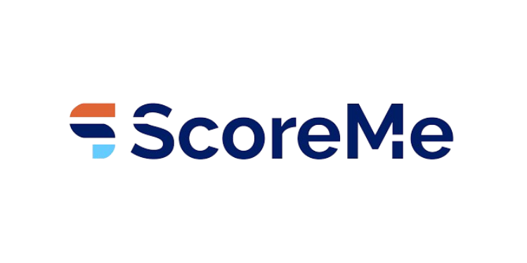
New Delhi: ScoreMe, the Indian fintech company specializing in AI-driven credit analytics and digital lending solutions for banks and NBFCs, has announced a comprehensive brand refresh aimed at reinforcing its visibility, familiarity, and recall among customers. With a strong foothold in a competitive market, the company is evolving its identity to better reflect its core values of innovation, reliability, and user-centricity.
The refreshed brand identity marks a strategic move to enhance ScoreMe’s position within the customer consideration set. By strengthening visual recognition and emotional resonance, the company seeks to ensure stronger brand recall and deeper engagement with its audience. The new identity integrates three core elements—Aesthetics, User Centricity, and Brand Values—into a design that feels familiar yet distinctly modern, underscoring ScoreMe’s forward-looking approach.

“This rebranding initiative is more than a visual update; it is a reaffirmation of ScoreMe’s mission to deliver innovative solutions with clarity and confidence. By combining aesthetics with meaning, the new identity ensures that ScoreMe stands out in a crowded marketplace while staying true to its values,” said Shashank Sharma, Co-founder & Director, ScoreMe Solutions.
“As ScoreMe continues to grow, this brand refresh marks a significant milestone in its journey toward becoming a more recognizable and impactful player in the industry. The new logo, colours, and typography collectively embody the company’s vision of stability, innovation, and trust.” Sharma added.
At the heart of the transformation is a newly designed logo built around the letter “S,” symbolizing the essence of ScoreMe. The upper extension of the “S” represents forward thinking and innovation, while bold blue typography conveys stability and a solid foundation. A touch of orange introduces vibrancy, signifying dynamism and futuristic thinking. Together, these elements create a logo that is both modern and meaningful.
The brand’s updated typography uses the Raleway typeface, known for its geometric elegance. The font strikes a balance between professionalism and youthful energy, with a mix of upper- and lower-case letters reflecting ScoreMe’s experience and expertise while projecting a fresh, progressive personality.
Colour plays a pivotal role in the refreshed identity. The palette has been carefully curated to communicate distinct brand values. Orange signifies positivity, enthusiasm, and security. Navy Blue represents stability, reliability, and expertise. Light Blue reflects wisdom, professionalism, and clarity. The brand name, displayed in deep navy blue, reinforces trust and dependability—qualities that remain central to ScoreMe’s ethos.
Through this refreshed identity, ScoreMe aims to sharpen its market presence while continuing to deliver technology-driven financial solutions that empower lenders with greater precision, confidence, and efficiency.

