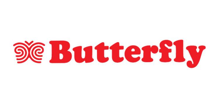
Chennai: Butterfly, a kitchen appliance brand, has announced a major brand transformation with the unveiling of a refreshed identity, signifying a new chapter in its legacy. Rooted in a renewed purpose and deeper consumer understanding, the brand is now positioned to reflect the evolving values of modern India—celebrating individuality, transformation, and authenticity.
At the heart of Butterfly’s bold refresh lies a powerful new visual identity anchored by the fingerprint—a symbol that merges seamlessly into the butterfly’s wings, capturing the uniqueness of every individual. The brand’s evolved icon is a tribute to the belief that while everything in life may change, the essence of who we are—our fingerprint—remains constant. It marks a celebration of originality, of how we cook, live, think, and create.
Targeting a new generation of zillenials—a mindset that goes beyond age to embrace self-awareness, adaptability, and rooted authenticity—Butterfly’s brand repositioning speaks to individuals who are comfortable with change but uncompromising about their identity. The brand has shifted its lens from demographics to psychographics, choosing to define its audience not by numbers or borders, but by attitude.
Butterfly’s refreshed positioning, ‘Celebrating Change’, reflects a deep understanding of modern Indian homes, where shifting roles, hybrid lifestyles, and tech-integrated living are the norm.
“For over 40 years, Butterfly has been a part of millions of kitchens across India. Today, as homes become more fluid and identities more self-defined, our new identity reflects not just who we are—but who we’re here for,” said Swetha Sagar, Chief Business Officer, Butterfly.
As a subsidiary of Crompton, one of India’s leading home solutions companies, Butterfly is now equipped with robust backing to deliver innovation-led kitchen solutions that are intuitive, aesthetic, and built for modern living. The new identity sets the stage for a complete revamp of its product lineup—across mixer grinders, cooktops, and other kitchen essentials—with a focus on durability, design, and user-intelligence.
The redesigned Butterfly logo is more than a visual shift—it’s a story in itself. Crafted from the unique swirls of a fingerprint, it symbolizes the millions of individuals—consumers, retailers, employees, and designers—who touch, use, and believe in Butterfly every day.
“This is more than a rebrand. It’s a reimagining of what it means to belong in a modern Indian kitchen. Butterfly is for the originals. The ones who grow, shift, and adapt, but never lose the essence of who they are,” Swetha added.
With this new chapter, Butterfly is poised to reaffirm its place in Indian households—not just as a utility brand, but as a companion to the dynamic, original, ever-evolving Indian consumer.